Graffiti styles range from quick, single-color tags and throw-ups to legible straight/bubble letters, large blockbusters and rollers, and complex pieces like wildstyle, 3D, calligraffiti, and stencil-based works—these are the different graffiti styles you’ll see most often. If you want to recognize them fast, look first at letter shapes and connections, whether there’s a fill or just an outline, color count, and scale; if you’re starting out, begin with tags and straight letters, then move to throw-ups and simple pieces, and use skinny caps for outlines, fat caps for fills, markers for handstyles, and rollers for huge blockbusters.
This guide shows you how to tell styles apart in seconds, which ones suit beginners, the tools and caps that pair with each approach, and where you’re likely to spot them. You’ll also find a side-by-side comparison table ranking time-to-paint, difficulty, color usage, and legibility, plus a realistic 30‑day practice path and common mistakes to avoid.
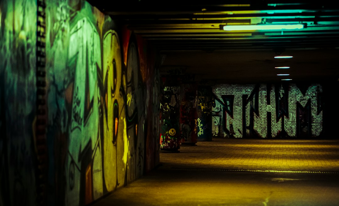
Quick guide to different graffiti styles
Here are one-sentence IDs you can use on a walk: Tag—single-color signature, quick flow; Straight letters—blocky, clean, readable; Bubble letters—rounded, soft, playful; Throw-up—fast two-color bubble outline with a simple fill; Hollow—outline-only throw-up; Blockbuster—huge block letters aimed at coverage; Roller—massive roller-painted letters on rooftops or trackside; Piece/masterpiece—multi-color, detailed, sometimes with background and characters; Wildstyle—interlocked arrows, bars, and connections that only writers easily read; 3D/anamorphic—letters with depth and shadows, sometimes photoreal illusions; Calligraffiti—script-style lettering using brushes or chisel caps; Stencil—crisp edges from cut templates; Stickers/slaps—printed or hand-drawn labels; Wheatpaste—paper posters pasted up; Pixação—tall, angular Brazilian script painted vertically; Anti-/ignorant style—deliberately naive letterforms with attitude.
Fast visual checklist
- Letter shapes and connections: simple blocks/bubbles vs heavy interlocks and arrows.
- Fill vs outline: full fill and outline, outline only, or just a marker tag.
- Color count: one color (tag), two colors (throw-up), many colors (piece).
- Complex cues: arrows, spikes, extensions, and overlapping bars signal wildstyle.
- Edge quality: razor-crisp edges point to stencils; soft feathered edges come from spray.
- Scale clues: roller strokes and rooftop placements suggest blockbusters/rollers.
- Extras: characters, 3D shadows, backgrounds, and highlights raise complexity and time.
Beginner path at a glance
Start with tags to build letter rhythm, move to straight letters for structure, practice bubble letters and two-color throw-ups for speed and can control, then attempt simple pieces with two to four colors. Save wildstyle and deep 3D for later once your foundations are clean and confident.
Common mistakes and quick fixes
- Wobbly tags: slow down a touch, lift your elbow, and practice on paper with a marker before the wall.
- Uneven bubbles: sketch circles and ovals on a grid; keep consistent stroke spacing and letter height.
- Messy straights: set a baseline and cap height, square your corners, and ghost-line before spraying.
- Throw-ups that take too long: keep forms simple, plan a two-color scheme, and use a fat cap for the fill.
- Early wildstyle unreadable to you: hide a simple straight letter skeleton under every complex build.
Comparison table: time, tools, colors, legibility
| Style | Quick ID | Typical tools/caps | Typical colors | Time to paint | Legibility | Difficulty (1–5) | Best for | Avoid if | Where you see it |
|---|---|---|---|---|---|---|---|---|---|
| Tag | Single-line name | Marker, skinny cap | 1 | Seconds | High | 1 | Beginners | You overcomplicate | Doors, poles |
| Straight letters | Square, readable | Skinny for outline, fat for fill | 1–3 | 5–20 min | High | 2 | Beginners | Legal walls, tracks | |
| Bubble letters | Rounded forms | Fat cap fill, skinny outline | 2–3 | 5–15 min | Medium | 2 | Beginners | Cut-throughs, yards | |
| Throw-up | Outline + quick fill | Fat cap, sometimes silver fill | 2 | 2–10 min | Medium | 2 | Beginner/intermediate | High-traffic spots | |
| Blockbuster | Huge blocks | Roller, fat caps | 1–2 | 15–60 min | High | 3 | Intermediate | Rooftops, highways | |
| Piece | Multi-color letters | Skinny caps, many cans | 3–8+ | 1–4+ hrs | Medium | 3–4 | Intermediate | Halls of fame, legal walls | |
| Wildstyle | Arrows, interlocks | Skinny caps | 4–8+ | 2–6+ hrs | Low (public) | 5 | Advanced | Early learning stage | Writer spots, jams |
| 3D/anamorphic | Depth and shadows | Skinny caps, soft caps | 3–6+ | 2–6+ hrs | Medium | 4 | Advanced | Short on time | Legal walls |
| Stencil | Crisp cut edges | Cut stencil + spray | 1–3 | Prep long, wall fast | High | 2–3 | All levels | No prep time | Doors, alleys |
| Stickers | Printed or drawn | Labels, markers | 1–2 | Seconds on site | High | 1 | Beginners | Want large scale | Street furniture |
| Wheatpaste | Pasted posters | Brush + paste | 1–4 | 1–10 min | High | 2 | All levels | Rainy, windy nights | Walls, boarded sites |
| Pixação | Tall angular script | Rollers, latex | 1–2 | Varies | Low (public) | 3–4 | Advanced | Fear of heights | High-rises, bridges |
Want a deeper dive into techniques and planning? Explore the practical guides on this site: street graffiti techniques: a practical field guide for artists and Mastering street graffiti styles: A Practical Field Guide.
Foundational styles: tags, straight letters, bubble letters, throw-ups, hollows
Tag. The base of everything is your handstyle. A tag is a signature drawn in one motion with a marker or skinny-cap spray. Writers add simple add-ons like a star, underline, halo, or arrow tip to personalize. Numbers often appear too: for instance, a number can represent a street, area code, or crew, and in some regions 13 is used within names or numbers to reference local culture or groups; meanings vary by city and context. Good tags flow, keep a consistent slant, and balance tall and low letters.
Straight letters. Straights take your name and turn it into squared, readable blocks. They teach spacing, baseline discipline, and corner control. Many straights use one fill color and a dark outline, plus a quick drop shadow. They’re ideal for trains, tracks, and legal walls where readers outside the scene can understand them at a glance.
Bubble letters. Rounded, inflated forms look friendly and read from far away. Keep each bubble size consistent, avoid thin weak areas where the outline collapses, and leave even negative space between letters to stop crowding.
Throw-ups and hollows. A throw-up usually means a two-color, fast bubble letter with a light fill and darker outline. A hollow is the same outline but with no fill, saving time and paint. Silvers (chrome fills) with black outlines are common for nighttime runs because chrome covers quickly and reflects light.
Beginner do’s: sketch your name in caps on paper, practice 10–15 handstyle variations, and pick one to develop. Don’ts: don’t copy someone’s exact handstyle, don’t jump to complex extensions before your straights are solid, and don’t outline too small—give your letters breathing room.
Intermediate and large-scale lettering: blockbusters, rollers, pieces, characters
Blockbusters and rollers. Blockbusters are about coverage and readability. Think giant block letters that shut down a wall visually. Rollers and latex paint let you reach tall facades and rooftops; poles and extended handles make it possible to paint from the ground. Edges can be taped or guided by snapped chalk lines for cleaner results. These shine on rooftops, riversides, or highway walls where size trumps detail.
Pieces/masterpieces. A piece adds fills, blends, outlines, 3D shadows, highlights, and sometimes a full background. Planning matters: sketch letter structures, pick a limited palette, and map layers so you don’t paint over your clean outline later. Expect higher paint use and longer sessions; if time is limited, cut the background and focus on strong letters plus one eye-catching effect.
Characters. Characters appear next to letters or star as the main subject. They can be cartoon mascots, realistic portraits, or graphic icons. Roles include storytelling, comic relief, or adding a focal point. When time is tight, a bold character with a simple name tag can finish a wall without the complexity of a full multi-color piece.
Practical note: Budget your time and paint. For a three-color piece on a legal wall, many writers plan 6–10 cans (fill, outline, background, effects) and 1–3 hours, adjusting to scale and weather.
Advanced lettering styles: wildstyle, 3D/anamorphic, calligraffiti, anti-style
Wildstyle. Wildstyle pushes letter architecture to the limit with arrows, spikes, bends, and interlocks. Readability drops for the general public, but writers see the hidden straights underneath. To keep it coherent, build a simple skeleton first, repeat motifs (for example, the same arrow head), and make negative space purposeful. Pitfall: adding decorations without structure, which makes the piece look busy rather than skillful.
3D/anamorphic lettering. 3D letters use light sources, cast shadows, and bevels to create depth. Anamorphic illusions align with a specific viewpoint so the piece pops only from one spot. Keep a consistent light direction and tone order (dark base, mid, highlight). Soft caps help with smooth blends, but remember that crisp edges in 3D outlines are what sell the illusion.
Calligraffiti. This merges calligraphy with wall-scale writing. Artists use chisel caps, mops, squeezers, and brushes to get thick–thin strokes like broad-nib pens. Scripts can be Latin, Arabic, or invented alphabets; the focus is on rhythm, pressure, and the dance of the line.
Anti-/ignorant style. This aesthetic embraces naive forms, awkward spacing, and intentionally rough execution to push against polish. It’s not a lack of skill; it’s a statement about attitude and rawness. The trick is to be deliberate—choose where to be crude and where to be sharp so it reads as a style, not a mistake.
Technique-based approaches: stencil, stickers, wheatpaste, etch
Stencil. Stencils are cut from paper or plastic, then sprayed for razor-sharp edges. They reward planning: you’ll spend the most time designing and cutting, then the wall hit takes seconds. Multi-layer stencils add color depth. They’re common for political statements and repeatable icons.
Stickers (slaps). Hand-drawn or printed labels carried in a pocket can blanket a city quickly. They’re perfect for testing logos, characters, and handstyle variants. A stack of prepped labels gives you hundreds of micro-placements at intersections, mailboxes, and signposts.
Wheatpaste. Print or draw on paper, brush a paste on the wall and back of the poster, and smooth it on. You can scale large with tiled posters. This suits illustration, collages, and photo-based designs.
Etch/acid. Some writers use etching fluids on glass to leave marks that can be very hard to remove. It’s controversial because of permanence and damage concerns; if you’re learning styles and techniques, focus on reversible media like markers, spray, and paint on legal or permissioned surfaces.
Context. Public interventions exist alongside legal walls and commissioned murals. Many cities support legal walls or festivals where you can practice styles at scale. To learn more about the broader street art ecosystem, see Legally-Protected Art or Vandalism? Navigating The Rules of Street Art and Dive Into Street Art: Techniques & Styles of Expression.
Regional scripts and subcultures: pixação, cholo/placa handstyles
Pixação (Brazil). Born in São Paulo and Rio, pixação features tall, narrow, angular letters painted vertically, often up the sides of buildings. Crews scale extreme placements with ropes to leave a signature that prioritizes visibility and bravery over legibility to outsiders. Its influence shows up worldwide in narrow, high-contrast letter trends.
Cholo/placa lettering (U.S. Southwest, especially Los Angeles). These handstyles draw from blackletter traditions and neighborhood placas (placards), with sharp serifs, vertical stress, and bold contrast. You’ll see it on walls, jackets, and lowrider culture ephemera. The aesthetic has informed global handstyles, especially in heavy-serif marker tags.
Regional styles shape the global scene by adding new letter grammars. When you travel, watch letter width, angle, serifs, and the tools used; they’re clues to local history and subcultures.
Tools, caps, and costs by style (+ 30-day beginner plan)
Cap types and what they do. Skinny caps give fine lines for outlines, details, and crisp corners. Fat caps lay down wide, fast fills and flares for throw-ups and blockbusters. Soft caps atomize more for smoother blends in fills and 3D shadows; hard caps produce sharper edges with less overspray. Keep a small organizer bag with 2–3 skinnies, 2–3 fats, one soft, and your preferred brand’s stock cap.
Markers, mops, rollers. Alcohol-based or paint markers work for tags on smooth surfaces and blackbook practice. Mops and squeezers lay thick, drippy tags on porous spots. Rollers and latex paint suit blockbusters and huge straights, especially on rough concrete where spray struggles to cover.
Budget ranges (typical, not fixed): A simple tag/straight session might use one marker and 1–2 cans; a two-color throw-up might use 2–3 cans; a small piece can run 4–8 cans depending on effects; blockbusters and rollers shift the cost toward latex paint and rollers rather than cans. Caps are consumables; expect a handful per session as they clog or wear.
Paint and cap consumption tips. Use lighter colors for fills to reduce coats, shake cans well to avoid sputter, and swap to a fresh skinny for the final outline. For big backgrounds, use rollers or buff paint to save spray for details.
30-day practice plan (30–45 minutes/day):
- Week 1: Handstyle bootcamp. Fill 10 pages a day with your name in different rhythms, heights, and slants. Focus on flow and letter balance. End each session by selecting the cleanest tag and rewriting it five times slowly.
- Week 2: Straights and bubbles. Draw one alphabet of straight letters daily, then write your name in straights and in bubble letters. Practice baselines, cap height, and equal spacing. Two sessions on wall-scale with light guidelines if you have a legal spot.
- Week 3: Throw-ups and two-color control. Design a two-letter throw-up, then expand to your full name. Practice fat-cap fills, smooth outlines, and quick highlights. Time yourself to keep the flow efficient.
- Week 4: Simple piece. Plan a two- or three-color piece with a drop shadow and one effect (a simple fade or cut). Sketch, choose a palette, and execute at wall-scale if possible. Photograph and self-critique against a checklist: letter consistency, clean outline, balanced negative space.
Digital aids vs real handstyle. Sketching apps and font generators can help explore layouts, but your handstyle improves most with physical repetition. Use digital tools for color tests and mockups; train letter rhythm with markers and cans.
FAQs about graffiti styles
What are the four types of graffiti? People often group them as tags, throw-ups, pieces, and productions (pieces with backgrounds and characters). Another useful grouping is foundational letters (tags/straights/bubbles/throw-ups), intermediate/large-scale (blockbusters/rollers/pieces), and technique-based (stencil/sticker/wheatpaste).
What does 13 mean in graffiti? Numbers can point to streets, crews, years, or local codes. In some cities, 13 connects to the thirteenth letter M or to specific groups. Meanings are location-dependent, so avoid assumptions and consider context and local norms.
Who are some famous graffiti artists? Widely recognized names include Dondi, Futura, Seen, Lady Pink, Os Gemeos, Kaws (early graffiti roots), and Banksy (often associated with stencils and street art). Each represents different eras and approaches—from train writing to gallery crossovers.
What are some popular graffiti fonts? Many design sites offer “graffiti fonts” for mockups, often mimicking bubble letters, drippy markers, or wildstyle vibes. They’re helpful for flyers and drafts, but real handstyles are written, not typed; the pressure, speed, and cap choice create nuances no font fully replicates.
Which styles are best for beginners and why? Start with tags to build flow, then straights and bubble letters for structure and spacing. Move to throw-ups to learn speed and can control, and aim for simple pieces when your outlines are clean. Save wildstyle and complex 3D once you can keep a steady line, consistent letter widths, and planned color order.
If you want a historical backdrop and ethical context while you practice, read A Visual Guide to street graffiti styles: History, Techniques, Ethics on this site.