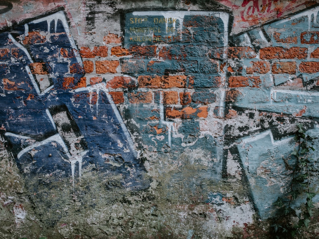
Street graffiti techniques can look simple from far away, but the work gets better when you treat every wall like a set of decisions. I want to talk about the parts that actually change the result: the wall itself, the sketch, the cans and caps, the order of layers, and the way you finish and document the piece. If you want a place to keep digging into this corner of the art world, the Albertini Arts home page has more street graffiti writing and visual references.
The biggest mistake I see is starting with color when the real question is structure. A good wall does not begin with a bright fill or a loud outline. It begins with a clear read on the surface, a simple plan, and a sense of how much detail the wall can actually hold before it turns muddy. Once those parts are in place, style has room to breathe. Without them, even a strong hand can get buried under rushed decisions.
This guide is written for artists who want practical control, not theory for its own sake. I am not interested in pretending that there is one perfect formula. A brick wall in afternoon heat, a concrete panel under streetlights, and a legal mural site with clean primer all ask for different moves. The point is to build habits that travel with you. If you understand the wall, the tools, the timing, and the maintenance, your work gets more consistent without becoming stiff.
Think of the process as five layers: reading, planning, marking, painting, and reviewing. Each layer is small on its own. Together they decide whether the wall feels confident or confused.
Why Street Graffiti Techniques Start Before Paint
The best street graffiti techniques usually begin before the first can is shaken. That sounds obvious, but it is where many pieces lose energy. People rush to the wall because paint feels like the real event. In practice, the real event is decision-making. What belongs on this wall. What can be read from six feet away. What shape needs breathing room. What line should stay simple because the wall already has texture fighting for attention.
When I plan a wall, I start by asking a few plain questions. How tall is it. How far away will people stand. Is the surface rough, slick, patched, or stained. Is the light flat or dramatic. Will the piece be seen in motion from a car, a sidewalk, or a train platform. Those answers matter more than a trendy fill pattern. A design that looks clever on a sketchbook page can collapse when it meets a rough surface and a strong sun angle.
There is also a mental side to this. A wall is not a blank sheet. It already carries history, damage, and context. Old tags, peeling paint, moisture marks, and safety barriers all shape what is possible. If you ignore that, you end up fighting the surface instead of working with it. If you respect it, the wall starts to tell you where the piece should open up and where it should tighten.
- Decide the reading distance before you choose the detail level.
- Check the wall texture before choosing thin or fat lines.
- Look at the light source before deciding where highlights belong.
- Build around the wall instead of trying to force the wall to disappear.
That mindset saves time later. It also helps the piece feel intentional. People often call that style, but I think it is closer to clarity.
Reading the Wall Like a Painter and an Editor
A wall is a surface, but it is also a set of conditions. The roughness of brick, the coldness of concrete, the gloss of a sealed panel, and the patchy look of old paint all change how color lands. One of the most useful street graffiti techniques is to read those conditions before you start drawing. Not after. Before. That means walking up to the surface and looking at it almost the way an editor looks at a page. What is already too loud. What should be cut. What needs more space.
Texture matters because it changes line behavior. On a rough wall, thin lines can break apart and fills may look dry or uneven. On a smooth wall, the same line can feel crisp and controlled. If the wall has stains or repairs, those marks can either become part of the composition or compete with it. I like to stand back, then move close, then stand back again. That back-and-forth tells me whether the wall wants a bold central form or a looser, more atmospheric piece.
Weather and light matter too. Heat can make paint feel different in the hand. Cold can slow down how a layer sits. Strong sun can wash out subtle color shifts that look beautiful in the sketch. Evening light can make outlines stronger than they looked at noon. If you have ever finished a piece and thought it looked better in the notebook, the wall may have been telling you the truth from the start.
Here is the test I use. If I can describe the wall in one sentence, I probably understand it well enough to design for it. For example, a wall can be “rough, tall, and bright” or “smooth, low, and shadowed.” That sentence helps me choose the kind of forms I should draw.
- Rough wall = stronger shapes, thicker outlines, fewer tiny details.
- Smooth wall = finer transitions, cleaner fills, sharper edges.
- Busy background = simpler composition and stronger negative space.
- Quiet background = room for texture, pattern, and layered marks.
That kind of reading is not glamorous, but it is the difference between a wall that fights you and a wall that supports the piece.
Street graffiti techniques for Planning a Piece That Can Grow
Street graffiti techniques get more useful once planning becomes a habit. Planning does not mean overdescribing the final look. It means knowing where the piece is going before your hand starts moving fast. A sketch can be tiny and still do the job if it answers the right questions. What is the silhouette. Where is the center of gravity. Which element gets the loudest edge. Where does the eye land first, second, and third.
I like to plan in layers. First the big form, then the supporting structure, then the detail. If the big form is weak, no amount of shine, drips, or sharp letters will rescue it. That is why some walls feel crowded even when the artist has good control. Everything is competing for the same space. The piece needs hierarchy. One part should lead, another should support, and a third should act like a pause.
The easiest way to test hierarchy is to make the sketch smaller than you think it should be. When a design still reads at a reduced size, it usually has enough structure for the wall. If it only works when you stare at the page, it may need simplification. That does not mean making it boring. It means deciding which details are essential and which ones are decorative noise.
Scale is part of planning too. A piece that fills a legal wall can carry more movement than one that sits on a narrow panel. Large walls can handle curves, open counters, and layered background textures. Smaller spots need tougher decisions and cleaner edges. The more constrained the wall, the more every mark has to earn its place.
- Start with a silhouette that reads from far away.
- Mark the center of interest before adding details.
- Leave at least one open area so the wall can breathe.
- Decide what will stay simple before deciding what will get fancy.
When planning works, the wall feels inevitable. That is a good sign. It means the drawing was not random decoration. It was a shape built for the surface.
Street graffiti techniques for Caps, Pressure, and Line Control
If planning gives the piece structure, tool control gives it voice. Street graffiti techniques often live or die on the way the artist handles caps, pressure, and distance from the wall. This is where practice gets physical. The same can can produce a soft fade, a hard edge, a thin trail, or a chunky fill depending on how it is used. That means the hand matters, but so does the way the tool is being held and moved.
Line control starts with distance. Move closer and the line tends to tighten. Step back and it opens up. Pressure changes the weight of the mark. A careful, even press gives a calmer line. A sharper press gives more force and a more aggressive edge. Cap choice also changes the feel. Some caps want precision. Others want speed. There is no universal cap that solves everything. The right choice depends on the wall, the weather, and the size of the form you are covering.
What helps most is learning the difference between a line that is drawn and a line that is thrown. A drawn line comes from slower, more deliberate movement. A thrown line comes from quick movement and confidence in the path. Both can work. Both can fail. The trick is to know which one the wall needs. A clean character outline may want a drawn line. A background burst may want a thrown one.
Practice should be boring on purpose. Work on straight lines, controlled curves, corner turns, and steady fills. Not because boring practice is noble, but because it reveals what your hand actually does. On a wall, nerves and time pressure will already distort your movement. The more basic control you have in advance, the less the wall will expose.
- Test caps on scrap surfaces before committing to the wall.
- Check how the can sprays at different angles.
- Practice slow curves and fast curves separately.
- Learn how far the paint travels before it breaks up.
Once you know those variables, style becomes cleaner. Not safer. Cleaner. That is a better goal.
Color Choices That Make a Wall Read Fast
Color in graffiti is not just decoration. It is a reading system. Street graffiti techniques become stronger when color helps the viewer understand the form immediately. The best walls do not depend on complicated palettes to feel good. They depend on contrast, balance, and a clear sense of which color is doing the speaking and which one is supporting it.
I start by asking whether the wall needs heat or calm. Warm palettes tend to push forward. Cooler palettes tend to settle back. High contrast creates energy, but too much of it can scatter attention. Low contrast can feel elegant, but if everything is soft, the piece may disappear at a distance. The goal is not to use more color. The goal is to use color with intent.
A practical rule is to choose one dominant color family, one contrast color, and one unifying neutral or dark. That does not mean every wall must follow the same formula. It means the palette needs a job. A bright fill with a dark outline can read strongly on a noisy background. A muted fill with a sharp accent can feel more measured. A limited palette can also look more mature because it forces the forms to carry some of the weight.
Color also behaves differently under street conditions. Sunlight can flatten subtle changes. Shadows can make dark colors merge with the wall. A color that looked rich in the can may dry flatter than expected. That is one reason samples matter. If possible, test small areas or note how a color behaves on a similar surface before you commit to a large composition.
- Use contrast to clarify the outline, not just to impress.
- Keep one color dominant so the wall does not split into fragments.
- Use darks to anchor and lights to guide the eye.
- Leave a little room between competing colors.
When color is disciplined, the piece looks louder. That sounds backward, but it is true. Clarity reads as confidence.
Layering, Outlines, and the Order of Marks
Layering is where a piece starts to feel built rather than dropped onto the wall. Street graffiti techniques depend heavily on order. If the layers come in the wrong sequence, the wall turns messy fast. If the order is right, the piece can have depth without feeling overloaded. I think of layering as a kind of editing. Each pass should either clarify the form, increase contrast, or add rhythm. If it does none of those things, it is probably extra.
Most walls benefit from a simple order. Lay down the base forms first. Add the fill. Lock in the outline. Then bring in accents, shadows, or secondary marks. Some artists prefer to reverse parts of that sequence depending on style. That is fine. The point is not to worship one order. The point is to understand why a particular order helps the wall stay legible.
Outlines deserve special care because they do a lot of work. A strong outline can separate layers, protect the structure, and give the piece its visual edge. A weak outline can make the whole wall look flat even if the fill was beautifully handled. On the other hand, if the outline is too heavy for the form, it can crush the piece. Weight has to match intent. Thin lines feel quicker. Thick lines feel more assertive. Both can work if they belong to the same visual language.
Shadows and highlights should also be chosen with care. A small highlight can open a form without taking over. A shadow can create depth, but too much shadow can make the wall hard to read. I usually ask whether the layer makes the piece easier to understand. If the answer is no, I hold back.
- Base layer first, detail layer last.
- Use outlines to separate, not to suffocate.
- Add accents only when the structure is already solid.
- Stop layering when the wall becomes clear, not when the can is empty.
That last point matters more than people admit. A finished wall is often the one you were willing to stop on time.
How to Mix Freehand, Stencil, and Hand-Built Detail
One of the most useful street graffiti techniques is knowing when to mix methods instead of trying to prove loyalty to one. Freehand brings energy and looseness. Stencils bring repeatable edges and sharper shape control. Hand-built detail, whether it is careful line work or layered accents, brings the personal mark that makes the wall feel alive. There is no rule saying these methods should stay separate. In fact, the strongest pieces often come from blending them in a way that serves the wall.
Freehand is good when the piece needs motion. It lets the hand lead and gives the wall a more spontaneous feel. Stencils are useful when the design needs repeated symbols, crisp shapes, or a sharp interruption inside a looser composition. Hand-built detail is what keeps the wall from feeling mechanical. It can be the small highlight that softens a hard stencil edge or the uneven line that reminds you a person made this, not a machine.
The key is not to let the methods compete. If the stencil looks rigid, the surrounding shapes may need more movement. If the freehand area feels too loose, a contained shape can pull it back into order. If the whole piece is stenciled, one or two hand-drawn marks can stop it from feeling frozen. I like to imagine the wall as a conversation between precision and breath.
There is also a practical reason to mix methods. Walls are not always cooperative. One area may need a faster approach because the texture is rough. Another may allow slower detail because the surface is smoother. A mixed method lets you adapt without abandoning the overall idea.
- Use freehand where motion matters.
- Use stencils where repeatability matters.
- Use hand-built detail where personality matters.
- Keep the methods in the same visual family.
The wall should look chosen, not patched together from different habits. That is the line I try not to cross.
Respect, Safety, and Working Legally Without Killing the Energy
Any serious conversation about street graffiti techniques has to include respect and safety. I do not mean that as a moral slogan. I mean it as part of the craft. A wall, a neighborhood, and the people around it all shape the final work. If you are painting a legal wall, a commissioned mural, or a practice panel, the cleaner your process, the easier it is to stay focused on the art instead of avoidable problems.
Start with permissions and local rules. That sounds dull, but it protects your time. It also changes the way you paint because you are not trying to work under the pressure of constant interruption. A legal wall gives you more room to test color, refine line work, and step back to review the piece. It can still feel urgent. It just does not have to feel chaotic.
Safety is equally practical. Gloves, a mask when appropriate, sensible clothing, hydration, and a tidy setup all reduce friction. So does keeping your tools organized before the first mark. I have wasted more energy by searching for the right cap than by making an ugly line. That kind of delay breaks rhythm. Rhythm matters in painting because it keeps decisions honest.
Respect also means paying attention to context. A wall near homes, shops, or public paths deserves a different tone than a private studio wall. If you are painting where people live or work, the piece should show some awareness of that setting. The art can still be bold. It just should not act as if the place does not matter.
- Work where you have permission or a clear right to be.
- Keep tools and materials organized from the start.
- Protect yourself from fumes, weather, and fatigue.
- Read the neighborhood context before deciding the tone of the piece.
Respect is not a brake on style. It is what lets the style stay focused long enough to matter.
Working Fast Without Losing the Piece
Speed is part of graffiti, but speed is not the same as rushing. One of the better street graffiti techniques is learning how to work quickly while keeping the piece legible. That is harder than it looks because speed tends to flatten judgment. You start chasing completion instead of shape. The wall gets covered, but the structure gets vague.
I think of fast work as compressed decision-making. You shorten the time between seeing a problem and fixing it. You do not skip the problem. You solve it with less hesitation. That means your layout, cap choice, and layer order have to be decided early. The fewer choices you leave for the middle of the wall, the more stable the final image will be.
Time pressure also changes how you simplify. A fast piece should not be a weak piece. It should be a more direct piece. Strong silhouettes, clear transitions, and limited detail are not signs of laziness. They are tools for staying readable under pressure. Some of my favorite walls have been the ones that knew exactly what not to do.
Weather can force this issue. Wind, heat, humidity, and uneven light all affect how you paint. When conditions move against you, the smartest move is often to reduce complexity. Save the finer detail for a calmer day or a better wall. That is not backing down. That is matching the design to the environment.
- Decide the layout before the wall starts demanding speed.
- Choose forms that survive rough conditions.
- Keep the number of color changes manageable.
- Know which details can be dropped without hurting the piece.
Fast work looks strongest when it feels inevitable. The viewer should sense motion, not panic.
Photographing, Reviewing, and Building a Personal Archive
Once the wall is done, the work is not over. Another useful part of street graffiti techniques is documentation. A piece changes when you photograph it well. The camera can flatten the piece, reveal mistakes, or make strong choices look even clearer. That is useful. It gives you a second reading that the wall itself cannot provide.
I like to shoot from a few distances. One image for the whole wall, one closer image for detail, and one from the angle a passerby might actually use. That third view matters a lot. It shows whether the piece reads in the real world or only in an idealized frontal shot. If you want to improve, the honest angle is often more helpful than the pretty one.
After that, I review the work without trying to defend it. Did the silhouette read fast. Did the outline carry enough weight. Did the color balance hold up in the image. Was there a spot where the wall texture overwhelmed the form. Was there a part of the piece that only worked because I was standing too close to it while painting. Those answers become notes for the next wall.
An archive is more than storage. It becomes your memory outside your head. With enough photos, you start to notice recurring habits. Maybe your compositions lean too hard to one side. Maybe your color choices repeat when you are tired. Maybe your cleanest walls come after you have simplified the sketch by half. That kind of pattern is gold because it tells you what your process is actually doing, not what you think it is doing.
- Photograph the wall from more than one distance.
- Review the piece in natural light if you can.
- Write one short note about what worked and what did not.
- Save the image with the wall name, date, and location.
Improvement is easier when the wall leaves a record behind it.
Maintenance, Touch-Ups, and Knowing When to Stop
Maintenance is one of the least glamorous parts of the process, but it matters. Street graffiti techniques are stronger when you know how a piece ages. A wall is not frozen the moment the paint dries. Light, dust, weather, and other marks will keep changing it. Sometimes that change adds character. Sometimes it steals clarity. Knowing the difference helps you decide whether to revisit the wall or let it live as it is.
Touch-ups should be small and purposeful. If a highlight faded faster than expected, fix the highlight. If a section of outline got lost, restore that edge. But avoid the temptation to keep reopening every decision. Walls can become weaker when the artist keeps trying to correct things that were already working. At some point, more paint does not mean more care. It can mean less trust.
Weather exposure is part of the conversation too. On walls that face hard sun or damp air, think ahead about which colors and details are most likely to shift. If a piece is expected to last, use that knowledge to make choices before you paint. Stronger contrast, simpler layers, and cleaner division between forms often age better because they stay readable as the surface changes.
There is also a mental practice here. Learning when to stop is part of skill. Not every wall needs one more line. Not every form needs another shade. Sometimes the most mature choice is to step back, sign off, and leave the wall with a little room for time to do its work.
- Fix only the parts that actually need correction.
- Expect weather to change the surface over time.
- Choose durable clarity over endless refinement.
- Let some walls end with a clean pause.
A wall that is allowed to breathe after the last mark often feels more confident than one that has been overworked into silence.
Good street graffiti techniques do not make every wall look the same. They make each wall easier to read on its own terms. That is the real prize. When you can move from planning to line control to color to finish without fighting the surface, style becomes a result of judgment instead of luck. Keep the sketch honest, keep the wall in view, and keep the archive open. The rest comes from repetition.