Great pictures rarely happen by accident. They are built, tested, and revised around a clear idea of how the viewer’s eye will move and what they will remember. That is why composition in visual art sits at the core of studio practice, from the first thumbnail to the last brushstroke or pixel. This guide gathers practical methods, critique questions, and historical examples so you can plan stronger images and improve the ones you already have.
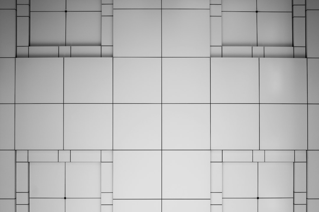
What artists mean when they talk about composition
Composition is the deliberate arrangement of visual elements to guide attention, communicate meaning, and create an experience. It concerns where things are placed, how big they are, what contrasts they carry, and how they relate in space and time. This is different from subject matter. Two paintings of a tree can feel nothing alike because one uses a low horizon, broad tonal contrasts, and a diagonal sweep that accelerates the eye, while the other uses a centered trunk, soft edges, and repeating verticals that quiet the scene. The subject stays the same; the composition changes the viewer’s journey.
At a nuts-and-bolts level, the building blocks are line, shape, mass, value, color, texture, and space. These are organized with principles such as balance, contrast, emphasis, movement, rhythm, pattern, unity and variety, hierarchy, alignment, proximity, and repetition. The tricky part is not knowing the words but making them work together toward a clear intent. Think of composition like stage direction: you decide where the actors stand, where the light falls, which door opens, and when.
Because composition is intent made visible, it starts before you render detail. Seasoned artists begin with thumbnails that test placement, value structure, and flow. They sketch several options quickly, then pick the best parts and iterate. A good habit is to ask with every pass: What should the viewer notice first, second, and third? What path takes them there? Which edges and contrasts will carry that path? Those questions form the backbone of this guide.
Why composition in visual art matters
When composition works, attention feels effortless, the mood is unmistakable, and the message lands. When it fails, even a beautifully rendered subject can feel confusing or dull. Composition in visual art is not a decorative layer; it is the structure that holds the image together. Consider a poster that needs to be legible from across the street, a portrait that suggests character without words, or an abstract canvas that relies entirely on relationships of color and form. In each case, composition is the engine that makes the image readable and memorable.
There is also a practical reason to get good at it: composition is one of the few levers you can study, practice, and apply across mediums. Painters, photographers, illustrators, product designers, sculptors, and motion artists all solve similar problems of balance, emphasis, and flow. The vocabulary changes a little, the tools a lot, but the underlying decisions rhyme. A photographer decides where to stand and when to press the shutter; a painter decides where to crop and how to group values; a 3D artist decides where to place the camera and how to light the scene. Each choice changes how the viewer reads the image.
If you want a single takeaway to carry into your next project, make it this: decide what the picture is about in one sentence, then build every compositional choice around that sentence. It becomes your compass when options multiply.
Classical frameworks you can actually use
Frameworks are scaffolding, not laws. They help you place things quickly and evaluate alternatives. Three useful ones are the rule of thirds, the golden ratio, and armatures (underlying directional structures).
The rule of thirds divides the frame into a 3×3 grid and suggests placing focal points near the intersections or along lines to avoid dead center stiffness. Try it as a diagnostic, not a straightjacket. If your focal point is dead center and the image feels static, nudging it toward an intersection often adds energy.
The golden ratio (about 1:1.618) and its spiral are historical darlings. Rather than chasing exact math, think of it as a bias toward asymmetry and proportional harmony. Many pleasing rectangles are simply not squares, not halves, but something slightly off-center that feels alive. When cropping or designing a layout, test a few rectangles near that proportion. The difference can be surprisingly strong.
Armatures are more powerful in day-to-day practice. Imagine invisible diagonals, S-curves, or radiating spokes that choreograph the eye’s path. You can build an armature by drawing arrows over your reference or thumbnail to show how the gaze might travel. Then strengthen that path with edges, value jumps, color accents, and implied lines (gestures, glances, roads, waves). If the arrows tangle or stall, simplify the structure and start again.
Design principles: a pragmatic checklist
Use this checklist before you commit to rendering or color. It saves time and improves clarity.
- Balance: Does the picture feel stable? Distribute visual weight (size, value, color intensity, detail, and isolation) so the image neither tips nor feels rigid. Asymmetry is usually livelier; symmetry can be powerful when the concept calls for ritual or order.
- Contrast: Where is the strongest contrast of value, color, edge, or texture? Put it near the focal area. Reduce competing contrasts elsewhere.
- Emphasis and hierarchy: What do viewers see first, second, and third? If everything is important, nothing is. Remove or mute elements that argue with the message.
- Movement and rhythm: Are there repeating intervals, directional cues, or flowing shapes that carry the eye? Rhythm comes from spacing and alternation; movement comes from vectors and curves.
- Unity and variety: Do the parts feel like they belong together? Repeat some shapes, hues, or textures to glue the image, then break the pattern in a controlled way where you want interest.
- Alignment and proximity: Align edges and group related elements to reduce noise. Clustering tells the viewer what belongs together.
- Repetition and pattern: Use echoing shapes and motifs to build cohesion or set up pleasant surprises when the pattern breaks.
Two quick tests expose problems: squint and mirror. Squinting collapses detail and reveals the value pattern. If the image still reads, the composition is sturdy. Mirroring (flip horizontally) shows unintended tilts and clutter because it breaks your familiarity with the picture. Many artists keep a small mirror or use a flip shortcut for this reason.
Visual weight and focal points: how attention really moves
Attention is drawn by differences and by things that look like they act on the world. High contrast, saturated color, sharp edges, and dense detail all pull weight. So do faces, eyes, hands, pointing fingers, text, and objects that imply motion. Isolated elements carry more weight than ones embedded in texture. Large simple shapes can outweigh clusters of small shapes if the simple shapes have strong contrast.
Create a focal area by stacking weights: place your highest value jump, most saturated accent, and a crisp edge or two in the same neighborhood. Then taper competing weights with softer edges, lower contrast, or less saturation. Spacing helps as well; a breathing zone around the focal area prevents crowding. If the eye ricochets across the frame, reduce the number of accents or join them into a path that leads home.
Compositional flow: paths, vectors, and edges
Flow is the choreography of the gaze. You build it with explicit lines (rivers, roads, branches), implied lines (a figure’s gaze, the angle of a limb), and edge hierarchy (where softness and sharpness cue movement). Think of your picture as a small landscape the eye strolls through. Diagonals energize; horizontals calm; verticals can feel solemn or grand. S-curves are versatile because they slow the eye while still moving it forward.
Make a habit of drawing arrows on thumbnails to predict the eye’s route. If the arrows loop endlessly with no rest, add a destination. If they stop dead at an edge, bridge across with a secondary cue. Edges matter: hard edges grab, soft edges release, lost edges invite the eye to connect missing information. A skillful mix of edges can make even a quiet subject feel alive.
Color and value structure: designing the light
Value is the backbone; color rides on it. A painting with a strong value design reads even when viewed in grayscale. Organize your scene into two or three big value families and keep local variations inside them. This is the essence of tonal design and of notan studies (simple black-and-white thumbnails). When the big value groups are clear, you can add subtle transitions without losing the read.
Color can reinforce the value structure or fight it. If you choose a high-contrast complementary accent (say a small hot orange inside a field of cool blues), ensure the value of that accent is also distinct enough to pop. If you need a quiet, atmospheric piece, keep hue changes gentle and value steps small, letting edges and texture carry interest instead of contrast.
Practical exercise: make three thumbnails of the same subject—one with dark figures on a light ground, one with light figures on a dark ground, and one with mid-tone figures against both darker and lighter grounds. Notice how the story changes with nothing but value.
Space and depth: staging the scene
Depth comes from overlap, scale, vertical placement, perspective, and atmospheric cues. You don’t need to show everything; you need to suggest the logic that lets viewers reconstruct space. Overlap is the simplest: when one shape sits in front of another, the brain reads depth. Size and vertical position help (smaller and higher often mean farther away). Linear perspective gives a precise scaffold, but even in stylized work, consistent vanishing directions lend credibility.
Foreground elements can frame the midground and lead into the background, creating a sense of entry. But be careful: a heavy foreground shape that carries too much contrast can steal the show. If the foreground is a foil, soften it; if it is part of the message, let it sing but coordinate it with your focal area.
Narrative and meaning: composition as argument
Beyond formal polish, composition carries meaning. Low angles empower subjects; high angles diminish them. Crowded frames feel claustrophobic; wide emptiness implies isolation or openness depending on context. Triangular groupings can suggest stability or conflict; spirals can feel inward (contemplative) or outward (expansive). Even abstract works argue through tensions between large and small, smooth and rough, warm and cool.
This is where semiotics—how signs create meaning—enters the studio. A ladder leans; a hand points; a door opens; we read these as actions. Arrange such signs to support your one-sentence intent. If the concept is ambiguity, design the image so multiple readings are plausible but coherent. If the concept is clarity, remove symbolic noise. Composition becomes a quiet argument your viewer feels before they rationalize it.
From thumbnail to finish: a repeatable workflow
Process turns good intentions into reliable results. Try this studio-tested sequence and adapt it to your medium.
- Define the intent: Write one sentence about what the picture is about. Keep it visible.
- Generate options: Produce 6–12 tiny thumbnails (under a minute each). Vary viewpoint, crop, value grouping, and flow. Mark two or three with promise.
- Choose an armature: For each promising thumbnail, draw arrows to reveal the eye-path. Keep one dominant path and one secondary.
- Set value families: Block in the image as two or three value groups with big shapes. Make sure the read holds when squinting.
- Place focal accents: Stack contrast, saturation, and edge sharpness where the story needs emphasis. Quiet the rest.
- Check balance: Counter big shapes with smaller counters, use spacing to relieve tension, and watch the corners so the eye doesn’t leak out.
- Color strategy (if relevant): Decide which hue family dominates and where complements appear. Protect the value design while you add color.
- Edge plan: Choose a few deliberate hard edges and many soft or lost edges that invite the eye to connect.
- Detail late: Reserve fine texture and micro-contrast for the focal area. Elsewhere, suggest rather than describe.
- Flip and step back: Mirror the image or view it small. Problems pop out when you change how you look.
Document your steps. Keeping a page of process notes turns isolated wins into habits. Over time you’ll learn which few decisions give you the biggest gains.
Evaluating and revising: a composition critique rubric
Use this rubric on your own work or in group critiques. Score each item from 1 (weak) to 5 (strong), then prioritize revisions.
- Clarity of intent: Can the one-sentence idea be inferred without a caption?
- Hierarchy: Is there a clear first, second, and third read?
- Value structure: Do big value groups hold when squinting or in grayscale?
- Flow: Does the eye have a guided path and places to rest?
- Focal area: Are key contrasts stacked where needed, and subdued elsewhere?
- Balance: Does the picture feel stable without being stiff?
- Unity/variety: Are repetitions used to glue parts, and variations used for interest?
- Edge design: Are edge changes purposeful, not accidental?
- Space: Is depth suggested coherently or intentionally flattened?
- Craft alignment: Do technique and finish support the composition (not fight it)?
After scoring, choose one or two changes that will move the needle most—often simplifying shapes, regrouping values, or relocating an accent. Small surgical fixes can transform a piece without rebuilding the whole image.
Common pitfalls and how to fix them
Many problems repeat across mediums. Here are frequent ones and practical remedies you can test in minutes.
- Everything is equally loud: Decide on a focal area, reduce contrast and detail elsewhere, and use spacing to create a breathing zone.
- Unstable or empty center: If the picture sags, add a mid-size shape that connects foreground and background, or introduce a curve that steers across the void.
- Tangent lines (awkward kisses): If edges barely touch, separate or overlap decisively. Tangents are tiny but distracting.
- Eye exits at the corner: Reduce contrast or add a return cue near the leak—an edge softening, a color echo, or a pointing shape that bends the path back.
- Muddy value relationships: Convert to grayscale and regroup values. Clarify which masses share a family and which are truly distinct.
- Foreground steals the show: Lower its contrast or sharpen edges where you actually want attention.
- Perspective drifts: Unify angles by re-establishing vanishing directions, or embrace a stylized flatness consistently.
When in doubt, remove something. Subtraction is often the fastest way to restore clarity.
Composition across mediums
Painting and drawing: You control every mark. Lean on thumbnails, notan, and edge hierarchy. Glazing, scumbling, or drybrush add texture without wrecking value groups. In charcoal or graphite, reserve your darkest darks and sharpest edges for the focal area.
Photography: Move your body. The most powerful compositional tool is where you stand and when you press the shutter. Use foreground framing to lead depth, and watch the edges of the frame to avoid tangents. If a scene is busy, look for large value shapes first, then wait for the moment when human gesture or light aligns with your armature.
Illustration and design: Grids and type hierarchy are your allies. Align edges, cluster related items, and give headlines or key visuals the clearest contrast. Negative space is not wasted; it’s structure.
Sculpture and installation: Composition unfolds in space and time. The viewer walks a path you can plan. Consider sightlines, focal stacking, and how light changes across surfaces. A work can pivot from confusing to compelling by controlling the first view on entry and the sequence of reveals as the viewer moves.
Digital and motion: Camera placement, focal length, and timing create compositional flow. In UI or product visuals, prioritize clarity of hierarchy and spacing—every pixel suggests relationships.
Historical case studies: what the masters teach
Caravaggio: Powerful chiaroscuro (light-dark contrast) converts value groups into stage lighting. Figures often form triangles or diagonal armatures that direct the eye. Try grouping your mid-tones tightly and letting a few sharp highlights carry the focal accents.
Hokusai: Bold shapes and rhythmic repetition create movement. In “The Great Wave,” arcs of foam echo the wave’s sweep and point toward the boats and distant mountain, a masterclass in flow and hierarchy.
Mondrian: Apparent simplicity hides strict compositional control. Variations in rectangle size, spacing, and color placement keep the eye circulating. Study his work to learn how unity and variety dance.
Rothko: Large, softly edged color fields build mood through proportion and edge. The lesson is not to imitate the look but to notice how proportion alone can transform feeling.
Georgia O’Keeffe: Cropping and scale shock the familiar. By bringing a flower to monumental size and pressing it against the frame, she forces new attention. Experiment with radical crops in thumbnails, then choose the one that best serves your intent.
Edward Hopper: Space tells the story. He uses emptiness, verticals, and light geometry to set mood and guide the eye. Notice how windows and doorways act as compositional portals.
Jacob Lawrence: Clear value families, bold shapes, and directional diagonals lead the eye while carrying narrative weight. His work shows how composition and story can be inseparable.
Building a lifelong practice
Composition is learned by making many small, reversible decisions over time. Keep a dedicated sketchbook for thumbnails and notan studies. Recreate the value structure of a favorite painting from memory. Give yourself weekly prompts like “design with two values only” or “build an S-curve in three scenes.” And, crucially, seek critique that speaks to hierarchy, value groups, and flow rather than only to detail and polish.
If you’d like more essays on art-making and studio habits, explore the resources at Albertini Arts. Then return to your current picture and test three quick changes: move the focal accent, regroup the values, and redraw the arrows of the eye-path. Most images improve dramatically with just those adjustments.
In the end, composition offers a fair exchange: plan your image with intention and it will carry your viewer where you want them to go. The craft is patient; it meets you every time you pick up a pencil, brush, camera, or stylus.