If you are planning your first or your fiftieth piece, this guide to street graffiti mural design is written for the real wall in front of you, not for a studio fantasy. I want to help you move from an idea to a finished surface with a clear plan, the right tools, and enough field sense to adapt when the wall pushes back. Outdoor work rewards preparation, patience, and a bit of humility. It is not just about style. It is about sightlines, weather, paint behavior, and the small decisions that keep a mural readable once it leaves the sketchbook.
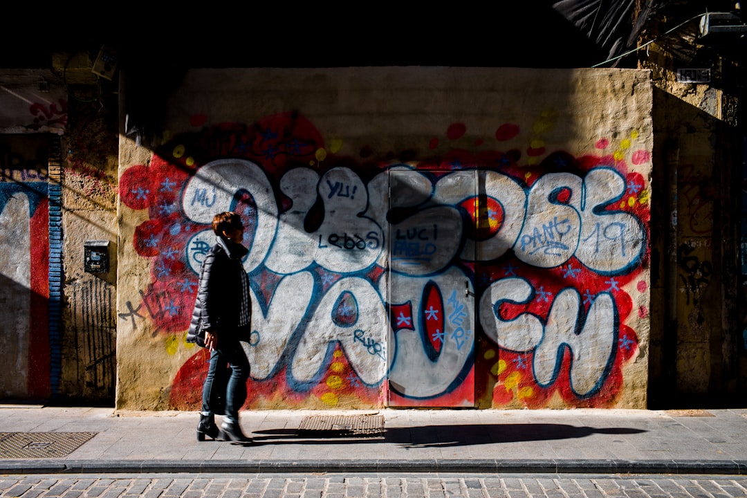
I also recommend keeping one reference folder open while you plan. I use the Albertini Arts street graffiti page as a visual check against my own ideas because live projects make it easier to judge scale, color balance, and wall context: https://albertiniarts.com/street-graffiti/. Looking at completed walls is one of the fastest ways to see where a composition still feels strong and where it needs more breathing room.
street graffiti mural design starts with the wall
Before I think about color, I think about the wall as a set of conditions. Is it brick, block, concrete, metal, or sealed wood? Does it sit in harsh noon sun, deep shade, or a mixed light path that changes by the hour? Does the viewer stand two meters away, twenty meters away, or across a moving street? Those answers shape the whole piece. A mural that looks elegant on a tablet can become muddy on rough masonry if the line weight is too delicate or the palette has too little contrast.
I like to stand at the main viewing point and ask one simple question, what does the wall already say before I add anything? Some surfaces feel busy because of cracks, vents, pipes, or old paint scars. Others feel quiet and open. A wall with a lot of texture usually wants bolder shapes, fewer tiny details, and a stronger outline system. A smoother wall can support more internal line work, finer transitions, and more controlled lettering. The surface is not a blank page. It is the first collaborator.
That way of thinking saves time later because it keeps me from forcing a concept onto a site that does not want it. If the wall is narrow and vertical, I usually stack forms upward rather than spreading them too wide. If the surface runs long and low, I stretch the rhythm horizontally and let the eye travel. If there is a doorway, window, pipe cluster, or utility box, I do not fight it. I either integrate it cleanly or give it a quiet margin. Good outdoor work is part composition and part negotiation.
One practical habit helps a lot. I photograph the wall from three distances. Close, so I can see texture and damage. Mid-range, so I can judge proportion. Far, so I can understand what a passerby will actually read. Those three images tell me more than a dozen loose ideas. They also keep me honest when I am tempted to overcomplicate the layout just because I can.
Start with a concept that survives distance
A mural concept has to do two jobs at once. It needs a strong identity up close, and it needs a clean silhouette from far away. That is harder than it sounds. A lot of pieces look exciting in a sketch because the artist can hold the paper in their hand. On a wall, the same forms may dissolve unless the basic structure is clear. That is why I begin with value shapes before I get attached to color.
I usually reduce the idea to three value bands. Dark, mid, light. If the composition still reads when I imagine it in grayscale, I know the structure can hold up outdoors. This does not mean the final piece has to look flat or dull. It means the bones are sound. Once the bones are sound, color can do more interesting work. If the bones are weak, color becomes decoration instead of function.
There is also a useful difference between a subject and a concept. A subject is the thing you draw. A concept is the reason the thing belongs on this wall. If I am painting a local hero, I still need to decide whether the wall should feel celebratory, reflective, tense, or playful. If I am painting letters, I still need to decide whether the rhythm should feel aggressive, smooth, stacked, or airy. That emotional frame matters because it keeps the piece from becoming a generic image with no point of view.
When I plan a concept, I like to ask three questions. What should a person understand in five seconds? What should they notice after a minute? What should still feel interesting when they see photos online later? Those questions keep the design from collapsing into one note. A strong wall often has one bold read, one secondary discovery, and one quiet detail for people who pause.
If you want to build that kind of design habit, make small paper studies and hold them at arm’s length. Then walk across the room and look again. If the concept fades too quickly, it needs stronger shape logic. If the shape logic gets too heavy, it needs more air. That simple distance test is still one of the best tools I know.
Choose materials that fit the surface and the weather
The more I work outdoors, the less I believe in a universal paint setup. The wall, the temperature, and the timing matter too much. A can that feels perfect in a cool studio can spray very differently under hot sun or steady wind. A roller that works well on drywall can drag on raw block. A cap that lays a thin line on smooth primer may spit or skip on a rough brick edge. Material choice is not about collecting more tools. It is about matching the tools to the site.
My base kit usually starts with a small but flexible color range. I keep one solid black, one bright white, a few core midtones, and several accent colors that can do more than one job. I want one black that can outline cleanly. I want one white that can sharpen highlights or correct a mistake without fighting the layer below. I want colors that can repeat in different parts of the wall so the piece feels unified instead of patched together.
Nozzles matter just as much as paint. I keep a small cap case sorted by flow. Thin caps for detail, medium caps for most lines, fat caps for fills and fast shape work, and a few soft caps for fades. I do not rely on one favorite cap for everything because outdoor conditions change too much. Wind, heat, can pressure, and wall texture all alter the result. Having a range gives me control.
Rollers are underrated. When I need to block a large background shape, I often reach for a roller before a can. It saves time, lowers overspray, and gives me a cleaner base for later detail. On rough masonry, a medium-nap sleeve usually gives enough bite without leaving a messy weave. On smoother walls, a shorter nap can help keep edges sharper. The point is not to be precious. The point is to use the tool that makes the next step easier.
For anyone building a kit from scratch, I would rather see a focused setup that you know how to use than a bag full of expensive extras. A small, dependable set of paints, caps, rollers, tape, gloves, respirator cartridges, rags, and a sturdy ladder will take you much farther than a fashionable but scattered collection. Master the kit you can carry, then expand it only when the wall demands more.
Color strategy is about value first and mood second
Color pulls people in, but value keeps them there. That is the rule I come back to most. If the color range is beautiful but the values are too close, the piece turns soft and messy at a distance. If the values are strong but the color plan is careless, the wall can feel heavy or noisy. The best outdoor color plans respect both. They separate clearly and still carry a mood.
I often start by deciding what role each color will play. One color carries the main field. Another color supports the field with contrast. A third color becomes the accent, the thing that makes the viewer pause. If I bring in too many equally loud colors, the wall gets tired fast. If I bring in too few, it can feel one-dimensional. I want the palette to have a hierarchy, not just variety.
Light conditions also change the palette. A deep blue can look rich in shade and almost black in direct sun. A yellow that seems warm in the studio can go chalky outdoors if it is overused or set against the wrong surround. That is why I test swatches on a scrap board or a hidden patch of wall whenever I can. I want to know how the colors behave in the actual site light, not in theory.
For readable outdoor work, contrast usually needs to be a little stronger than you first think. People are walking, riding, or glancing from moving vehicles. They are not studying the wall with a magnifying glass. So I lean toward clean separations, simpler gradients, and clear edge relationships. If I want a fade, I make sure the fade serves the structure instead of replacing it. If I want a glow, I keep a hard edge nearby so the piece does not dissolve.
The most useful question I ask is simple. If this wall were viewed in a single grayscale photo, would the structure still hold? If the answer is yes, color can then add the finish, not the rescue. That is usually where the stronger murals begin.
Surface prep decides how the paint behaves
People talk a lot about spray technique, but I have seen more murals fail because of poor prep than because of bad can control. Dust, peeling residue, grease, moisture, and loose texture can change the way a wall accepts paint. If I skip the prep, I am gambling with the finish before I even draw the first line.
My first pass is always a physical inspection. I run my hand along the wall, check for chalky residue, test for flaking sections, and look for damp spots or old repairs. If the wall sheds dust when I touch it, I brush or wash it until the loose material is gone. If the surface is very thirsty, I may need a base coat or a primer that suits the wall type. I do not want the first layer of color to disappear into the surface or peel back a week later.
Cleaning should match the site. A stiff dry brush may be enough for some brick. Mild soap and water can help on coated surfaces. Metal shutters often need a degreaser and a light scuff so the paint has some tooth. Wood panels need special attention to edges, seams, and moisture entry points. I do not use the same prep logic everywhere because the material underneath is different everywhere.
Masking is useful, but it should not become a crutch. Tape works best when I press it carefully into the texture and keep my spray angle controlled. On rough walls, I do not expect perfect surgical edges from a rushed application. I expect smart placement, steady pressure, and a willingness to fix the border by hand if needed. The wall will tell me where the line can be crisp and where it should be allowed to breathe.

I also like to think about priming as a way to establish a common working surface, not as a magic fix. The wall still has personality after primer. The texture still matters. The moisture still matters. But a stable base makes every later decision easier. It gives the layout a better chance to stay true when the weather shifts or the session gets longer than planned.
Layout choices should follow movement, not just symmetry
When I map a wall, I think about how the eye will move across it. Some murals need a diagonal push that pulls the viewer from corner to corner. Others work best as a centered anchor with calmer supporting forms around it. The key is to make the movement feel intentional. Random movement reads as clutter. Directed movement reads as energy.
For letter-based work, I like to think in terms of baseline, height, and weight. The letters should not just sit there. They should feel like they belong to each other. A strong baseline gives the piece a place to rest. A clear cap height keeps the structure stable. Variation in weight gives the wall rhythm. If everything has the same thickness and the same angle, the piece can become stiff.
For character-driven murals, overlap is helpful as long as it makes sense. A figure can break through the letter structure. A hand can point toward the focal point. A background shape can frame the subject without smothering it. The best overlaps solve a layout problem and a storytelling problem at the same time. They are not just decorative collisions.
I also pay attention to empty space. New muralists often feel pressure to fill every open inch. I understand that impulse. Empty space can look unfinished when you are close to the wall. But from the sidewalk, empty space often gives the composition a better read. It lets the focal point breathe. It creates a pause between heavy forms. It keeps the wall from becoming visual noise.
If a wall has architectural interruptions, I sometimes use them as anchors. A pipe can become a border. A window can become a framing device. A doorway can become the break between two visual zones. The point is to use the site rather than merely cover it. That habit makes the final piece feel more rooted to the location and less like a portable design pasted onto a building.
Build the piece in layers and keep checking the read
The easiest way to lose control outdoors is to work too far into detail before the major shapes are stable. I try to build murals in layers. Large blocks first. Mid-scale structure second. Outlines and refinements after the piece already makes sense from a distance. This does not mean I work mechanically. It just means I keep the hierarchy intact.
I usually begin with the biggest shapes or the broadest letter masses. If I am rolling a background, I want that field clean before I start cutting edges into it. If I am painting a character, I want the main silhouette in place before I obsess over expressions or tiny highlights. The first task is to establish the read. The second task is to raise the level of information without losing the read.
Step-backs are essential. I do not trust the wall at arm’s length for very long. I put the can down, walk across the street, and look at the piece as if I am seeing it for the first time. Does the composition still feel balanced? Is the focal point too weak? Did one side become too heavy? Is the wall fighting the environment around it? Those questions are more valuable than another five minutes of detail work when the structure is off.
I also keep a few corrections ready. White can sharpen a highlight. Black can restore an edge. A neutral midtone can calm a mistake when a section got too loud. The goal is not to hide every error as if I am afraid of them. The goal is to keep the wall coherent. Outdoor work has a little friction built into it. A smart artist plans for that friction instead of hoping it will not show up.
When people ask me why a mural feels finished, the answer is often that the layers have been placed in the right order. The viewer may not know the order consciously, but they feel the stability. Big forms anchor the eye. Mid-size shapes guide the motion. Fine detail rewards close looking. If those levels are scrambled, the wall loses clarity fast.
Can control comes from practice, not from luck
Spray can work is a skill, but it is also a rhythm. The can has pressure, angle, distance, speed, and cap choice. Change one of those variables and the line changes. Outdoor artists spend a lot of time learning how small the margin can be between a clean stroke and a rough one. That is why practice on boards matters.
I still test lines before committing to a wall edge that matters. I test how the can behaves when it is cold, when it is warm, when the cap is new, and when the cap is already a little dirty. I test how the stroke widens or tightens if I move my wrist instead of my whole arm. I test how the paint lays down if I work closer or farther from the surface. Those little tests teach me more than trying to force the same motion every time.
Fades are their own discipline. If I want a smooth transition, I keep the can moving and overlap lightly instead of blasting one area repeatedly. I work the fade in passes. I do not chase perfect softness immediately. I build it. That makes the result cleaner and gives me more control over where the gradient actually lands.
Lines on rough walls need patience. Mortar joints, pits, and chips can break a thin stroke. Instead of fighting the texture, I adapt the cap and movement. Sometimes a slightly thicker line reads better than a line that disappears in the surface. Sometimes the cleanest answer is to let the roughness stay visible and build the design around it.
If you are still developing your hand, do not judge yourself only by the finished wall. Judge yourself by the small repeatable gains. Did the line hold steady? Did the cap behave the same on the left side and the right side? Did the fade feel more controlled than last month? Those are the signs that the work is getting stronger.
Safety, access, and neighborhood etiquette matter more than ego
Outdoor painting happens in shared space. That changes the tone of the work. I have to think about traffic, pedestrians, neighbors, noise, ladders, lifting, and the people who live with the wall after I leave. Good etiquette does not weaken the art. It makes the art possible.
Respiratory protection is not optional when I spray for long sessions. Gloves help keep wet paint off my skin. Eye protection matters more than people think when wind shifts suddenly or when I am working overhead. If I am on a ladder, I want level footing, stable placement, and a spotter when the setup is awkward. I would rather move the ladder three extra times than lean too far for a quick line.
Weather can alter a day fast. Wind pushes overspray. Heat changes pressure. Sudden moisture changes the way a layer sets. I try to paint in the right window rather than forcing the wrong one. If a session becomes uncomfortable, rushed, or unsafe, I reset. That is not a lack of commitment. It is respect for the wall and for the people around it.
Neighborhood communication helps more than people expect. A short conversation with nearby residents or a shop owner can make a project feel less mysterious. I explain the hours, the materials, and the fact that I am trying to keep the site clean. That kind of simple contact often lowers tension before it starts. It also makes the wall feel like part of the place instead of an intrusion.
As for site etiquette with other writers, I keep it simple. I do not go over someone else’s piece without a conversation. I do not step into a shared wall and act like the whole surface belongs to me. If the wall carries a memorial or a community story, I handle it with care. Reputation in this scene travels fast, and the artists who get invited back are usually the ones who made the site easier for everyone else.
Permissions, agreements, and documentation protect the work
A lot of promising murals go sideways because the practical side was handled loosely. I have learned that a quick sketch is not enough when an owner, a business, or a community group is involved. A short agreement can save a project from confusion later. It does not need to be theatrical. It just needs to be clear.
I try to lock down the basics early. What is the wall size? What is included in the concept? Who buys the materials? What days and hours are available? What happens if rain delays progress? Can I photograph the finished wall? Can I share process images online? Will there be a follow-up session if a small section needs attention? These are boring questions only until they become expensive questions.
Documentation is part of the craft. I photograph the wall before I begin, during the process, and after the final pass. I save the sketch, the color plan, and notes about the products I used. If I return later for a freshening pass, I need that record so I can match the work. Documentation also helps with social media, proposals, and future wall estimates. It is the memory of the project.
When I share the finished wall online, I like to include enough context for people to understand where it lives and what shaped it. That does not mean oversharing sensitive details. It means being precise about collaborators, location type, and the idea behind the wall. When a project involved a neighborhood group, I credit them. When a business gave access, I thank them. Clear credit builds trust.
A good agreement and a good archive do more than protect me. They make the project easier to understand for everyone else. That matters when the wall becomes part of a larger conversation in the neighborhood.
Care, touch-ups, and weathering are part of the life cycle
Once the wall is done, the clock starts immediately. Sunlight, dust, rain, and city activity begin changing the surface. That does not mean the piece failed. It means the piece is living outdoors. I like to think about care as a normal part of the mural cycle, not as a rescue mission.
Some walls need only an occasional check. Others sit in busy corridors and need more attention. I usually come back after a short period to see how the colors settled and whether any edge needs a small correction. A light adjustment with a matching can can make a large difference. Feather the fix into the original work, do not slap it on as if it were a patch.
If I am sealing a wall, I choose a clear coat that suits the site and the paint beneath it. I want a finish that does its job without making the wall look greasy or overworked. The goal is to lower exposure to grime and sun, not to turn the surface into plastic. The best clear layer is the one most viewers never think about directly.
Weathering is not the enemy either. A mural that softens slightly with time can still hold its presence if the structure was strong to begin with. That is another reason I care so much about value, layout, and scale. Those elements survive better than tiny details. If I know the wall will age, I design for that reality from the beginning.
Care notes should be simple enough for the owner to understand. Keep the wall clean. Avoid harsh scrubbing. Call me if a section chips, blisters, or gets marked. Small habits make a larger difference than people expect. A wall rarely asks for dramatic intervention. It usually asks for steady attention.
Common mistakes and a reusable checklist
Most bad outdoor pieces do not fail because the artist lacked talent. They fail because one or two practical decisions were ignored. The composition might have been too busy for the surface. The palette might have been too close in value. The wall might not have been cleaned well enough. The layout might have been too eager to fill space. These mistakes are common, and that is why they are worth naming plainly.
One common mistake is trying to put every idea into one wall. The wall becomes a storage unit for sketches instead of a focused image. Another mistake is designing only for the camera and forgetting the person standing across the street. Another is choosing colors that look good independently but collapse together outdoors. I have made all of those mistakes, and the wall always tells on me.
Here is the checklist I return to most often before a session.
- Photograph the wall from close, mid, and far distances.
- Confirm the surface type and note rough patches, moisture, or old coating.
- Decide the main viewing angle and the main reading distance.
- Reduce the concept to clear value groups before getting lost in color.
- Choose a palette with a visible hierarchy, not just a lot of options.
- Sort caps by flow so I can switch quickly when the surface changes.
- Clean and prep the wall before committing to the first major layer.
- Build the composition in layers, with the biggest shapes first.
- Step back often and check the read from the street or sidewalk.
- Keep a small correction plan for edges, highlights, and quiet fixes.
- Document the wall before, during, and after completion.
- Leave the site cleaner than I found it.
I keep that list because it keeps me honest. It reminds me that outdoor work is not just a performance. It is a chain of decisions. When the chain is strong, the wall holds together. When one link is weak, the whole thing starts to feel thin.
That is why I keep coming back to the same mindset. Read the wall. Respect the site. Choose tools that fit the surface. Keep the composition clear enough to survive distance. Let the details reward a closer look. If those pieces line up, the final mural has a better chance of feeling grounded, direct, and alive on the wall where it belongs.